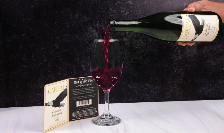
The wine industry has seen significant growth in recent years, with over 10,000 wineries currently operating. In a crowded market, it’s important to make your product stand out. A unique and memorable wine bottle label can help.
If you are creating a custom wine bottle for a special event or starting a new brand, here are some label design trends. These tips will help your wine stand out on the shelves.
Use Foil in Label Design
Foil is a popular choice for adding dimension and visual appeal to wine labels. A touch of foil can make a label stand out without overdoing it. This technique adds elegance and gives a high-end feel. It is perfect for premium wines that want to show luxury and quality.
Using Micro-Textures for Labels
Labels with unique textures can make a wine bottle more appealing. They add a fun sensory experience, engaging customers with both visuals and touch. This gives it a handcrafted look. Similarly, Pointillist’s diamond allure design uses water-resistant material, which not only enhances durability but also adds to the tactile experience.
Choosing the right label design tool is important for adding textures. It helps you easily personalize your wine bottle labels. This way, you can match the labels to the experience you want.
Implementing Specialty or Custom Die Cuts
Specialty cuts for labels can add extra dimension and uniqueness. Custom die cuts are a rising trend, allowing wine brands to express their personality through unconventional shapes. Die cuts, paired with custom labeled designs, can transform your wine bottle from standard to extraordinary.
This technique is great for anyone who wants to move away from standard rectangular labels. It helps use different label templates to grab consumer attention.
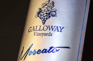
Embracing Traditional/Vintage Look
The traditional or vintage look remains a popular choice, especially for small-batch or handcrafted wines. These designs often evoke nostalgia and a sense of authenticity, which resonates with consumers who appreciate artisanal craftsmanship. This design gives the product a classic and rustic look. If you are making custom wine labels, using vintage styles can showcase your winery’s heritage.
Storytelling through Labels
Labels aren’t just about aesthetics—they can also be powerful storytelling tools. Many wineries use their labels to share the story of their brand, the winemaking process, or the origins of the wine. With labels on both the front and back of the bottle, there is ample space to engage with your audience.
For example, use the front label to create a strong visual impact. The back label can share the wine’s unique story, from vineyard to bottle. You can improve this by adding text and photos. This will make the story more engaging and help your product connect better with customers.
Consider Typography and Color Psychology
Another key factor in wine label design is the choice of typography and color. The typeface you select should reflect your brand’s identity and resonate with your target audience.
Serif fonts give a sense of tradition and elegance. In contrast, sans-serif fonts seem more modern and friendly.
Color is also important in label design. Deep reds, rich golds, and earthy tones suggest warmth and sophistication. Lighter pastels or bright colors can create a sense of playfulness. This makes them perfect for rosés or summer wines.
Sustainable and Eco-Friendly Packaging
As consumers become more environmentally conscious, the demand for eco-friendly wine labels is on the rise. Using sustainable materials can attract eco-conscious customers to your wine. You can use recycled paper, biodegradable inks, and water-based adhesives. These choices show that you care about the environment.
Sustainability shows that your brand cares about the environment. It also helps you stand out in a crowded market. Some wineries now use personalized wine labels made from recycled grape pulp, further reinforcing their eco-friendly values.
The Role of Minimalism in Label Design
Minimalism has found its place in wine label design, favoring clean lines and simplicity. Minimalist labels highlight key details such as the winery name, logo, and vintage year. They avoid clutter by not including too much information. This approach can create a sense of modern elegance.
By using neutral colors and generous white space, minimalist labels often feel sophisticated and exclusive. Custom wine labels that are simple and high-quality can show the value of the wine clearly. They do this without confusing the consumer.
Start Designing Your Label
When creating your wine label, it’s essential to choose the right label design tool. Many platforms provide templates that let you customize your label. You can choose the shape and size that fits your bottle best. From there, you can start designing your label, experimenting with different fonts, images, and finishes.
Once you have your design, it’s important to test the label size on your wine bottle to ensure the perfect fit before printing. Feel free to check out custom labels. They can make your bottle special and fit your audience perfectly.
The Importance of Consistency in Labeling
Consistency is key when it comes to branding through label design. Whether you’re producing wine for a small boutique winery or a large-scale operation, maintaining a uniform look across all your labels reinforces brand identity. Consistent typography, color schemes, and design elements help build recognition and trust with your customers. Over time, this visual consistency becomes a symbol of quality and reliability, making it easier for consumers to identify and connect with your brand, no matter where they encounter it.
Conclusion
When designing a wine label, it’s crucial to consider these trends and tips to create a distinctive, eye-catching product. A wine label is usually the first thing a customer sees from your brand. Make sure it shows your values and stands out on the shelf.
To make your wine label stand out, incorporate foil, textures, and specialty cuts. Use storytelling, thoughtful typography, and color psychology to further engage your audience.
Finally, don’t hesitate to use both traditional and modern design styles. Also, think about eco-friendly materials to attract environmentally conscious consumers. A good wine label can attract and keep loyal customers. This makes your brand stand out in a competitive market.
Wine Label Design FAQs
What makes a wine label stand out?
A wine label stands out by combining elements like foil embossing, unique textures, and custom die cuts. Using a mix of modern and traditional design techniques, such as color psychology, storytelling, and minimalism, can help make the product visually appealing and memorable.
How important is storytelling in wine label design?
Storytelling is a powerful tool in wine label design. Sharing the vineyard’s history, the winemaking process, or details about the specific wine helps create a deeper connection with consumers, allowing them to feel a personal connection to the brand.
What is the significance of color psychology in wine labels?
Color psychology influences how consumers perceive a product. For example, rich reds and golds evoke a sense of sophistication and tradition, while pastels and bright colors convey playfulness, making them ideal for lighter wines like rosés or summer blends.
How does typography affect wine label design?
Typography is crucial in reflecting a brand’s identity. Serif fonts give an air of tradition and elegance, while sans-serif fonts offer a more modern, approachable feel. Choosing the right typeface can significantly impact how a wine is perceived by potential customers.
Why are custom die cuts becoming a trend in wine labels?
Custom die cuts offer brands a way to break away from traditional rectangular labels, giving bottles unique shapes that draw attention. This trend allows wineries to express their personality and make their bottles stand out on crowded shelves.
How can eco-friendly packaging benefit a wine brand?
Eco-friendly packaging appeals to environmentally conscious consumers. By using recycled materials, biodegradable inks, or labels made from grape pulp, brands can showcase their commitment to sustainability, which is increasingly important in today’s market.
What are the benefits of using foil on wine labels?
Foil adds a luxurious and elegant touch to wine labels, helping premium wines convey quality and sophistication. A touch of foil embossing can catch the light, drawing attention to the bottle and enhancing its visual appeal without overwhelming the design.
What role does minimalism play in modern wine label design?
Minimalism emphasizes simplicity and clarity, using neutral colors, clean lines, and generous white space. This approach creates a modern, sophisticated look that feels exclusive, highlighting the key elements such as the winery name and vintage year.
Why is texture important in wine label design?
Texture adds a sensory experience, making a bottle more tactile and engaging. Embossed or micro-textured labels provide a premium feel, encouraging customers to pick up the bottle and explore its details, which can positively influence purchasing decisions.
What design elements should small wineries focus on to attract attention?
Small wineries should focus on storytelling, traditional or vintage looks, and sustainable packaging to emphasize their artisanal craftsmanship. Custom label shapes, rich textures, and thoughtful typography can also help differentiate their products from larger brands.
How can I design a wine label that reflects my brand’s identity?
To design a label that reflects your brand’s identity, consider your brand’s core values and target audience. Use color schemes, typography, and textures that align with your brand’s story. Incorporating elements like foil, minimalism, or vintage styles can further reinforce your brand’s message.
What are some tools for creating custom wine labels?
Many online design platforms offer customizable templates for wine labels, allowing you to choose from various fonts, colors, and textures. Some popular options include Canva, Adobe Spark, and professional label design services that offer custom die cuts and high-end finishes.
Choosing the Right Label for Every Application
Just like selecting the perfect design for a wine label, it’s essential to choose the right type of asset tags for your equipment. Whether it’s for outdoor durability or specific environmental needs, having reliable labels is key to seamless operations.