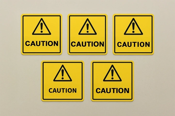
The best caution sign font is bold, clear, and highly readable from a distance. Popular choices include Arial Bold, Helvetica Bold, Roboto Bold, Source Sans Variable Bold, and Univers Bold.
These fonts ensure your industrial caution labels are noticed and easily understood, keeping safety front and center. Using a standard caution sign font is essential for maintaining consistency and clarity, especially in industrial and public settings.
Top Fonts for Caution Signs
Choosing the right font for your caution signs is essential to ensure your message is seen and understood. Here are the best fonts that make caution signs clear and impactful:
Arial Bold
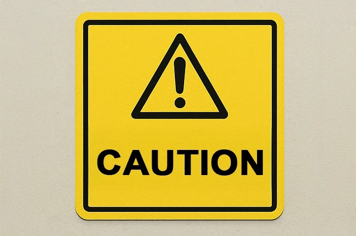
Why It Works: Clean and professional with thick, bold lines.
Best For: Industrial warnings, road signs, and safety labels.
Readability: Highly readable even from long distances.
Compliance: Often considered an OSHA-approved caution font due to its legibility.
Helvetica Bold
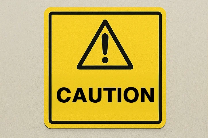
Why It Works: Sleek and modern, commonly used for road and safety signs.
Best For: Outdoor signs and corporate safety notices.
Readability: Crisp and clear, both in uppercase and lowercase.
Roboto Bold

Why It Works: Highly legible and versatile; designed for screens but excellent in print.
Best For: Construction signs, caution notices, and digital safety prompts.
Readability: Clear at various sizes and distances, with good letter spacing.
Compliance: Popular in professional design environments, including tech and industry.
Source Sans Variable Bold
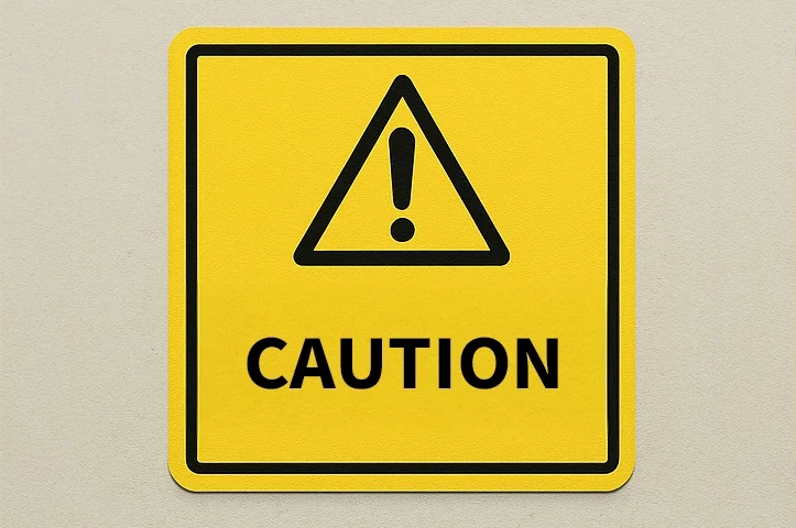
Why It Works: Designed for user interfaces and clarity, making it ideal for signage.
Best For: Indoor facility warnings, instructional labels, and equipment tags.
Readability: Smooth, balanced characters with high legibility in bold weights.
Compliance: Part of Adobe Fonts, easy to access for commercial use.
Univers Bold
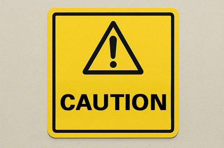
Why It Works: A classic neo-grotesque typeface known for its neutral, structured look, making it perfect for professional signage.
Best For: Facility safety signs, compliance labels, and industrial nameplates.
Readability: Uniform character width and high contrast make it extremely readable across different media and sizes.
Compliance: Used in many regulated environments; available via Adobe Fonts and widely supported in professional design software.
How to Choose the Right Caution Sign Font
Picking the right font isn’t just about boldness—it’s about clarity and usability. Here’s what to keep in mind:
- Go Bold: The thicker the font, the more readable it is from afar.
- High Contrast: Combine black and yellow or white and red for maximum attention.
- Test Distance: Make sure the text is readable from at least 20 feet away.
- Stick to Simple Fonts: Avoid cursive or decorative fonts that reduce clarity.
- Check Real-World Conditions: Test your sign in both natural and artificial lighting to ensure visibility.
Where to Find the Best Caution Sign Fonts
If you’re looking to download or purchase caution sign fonts, here are some great sources:
- Google Fonts: Free options like Roboto Bold and Oswald.
- Font Squirrel: Bold fonts that are free for commercial use.
- Adobe Fonts: Premium options such as DIN Condensed Bold.
- DaFont: A variety of bold, impactful fonts suitable for caution signage.

Tips for Designing Effective Caution Signs
- Font Size Matters: Choose sizes that suit the viewing distance.
- Color Combinations: Stick with industry standards like black on yellow or white on red.
- Consistent Layout: Keep your sign consistent with clear spacing and alignment.
- Weather-Resistant Materials: Use durable materials to ensure longevity and clarity.
Caution Sign Fonts FAQs
Fonts like Arial Bold, Helvetica Bold, Roboto Bold, Source Sans Variable Bold, and Univers Bold are among the best. These fonts are bold, legible, and highly effective at capturing attention—making them perfect for safety messaging.
Arial Bold is commonly used as a standard caution font due to its strong legibility and professional appearance. Helvetica Bold, Roboto Bold, and Univers Bold are also widely used across industrial and public safety signage.
Arial Bold meets key OSHA requirements for visibility and readability, making it ideal for compliance signage. Its thick strokes and simple character design enhance legibility at long distances.
Use bold, high-contrast fonts, such as black text on a yellow background or white on red. Select font sizes suitable for at least 20 feet of visibility and avoid script or decorative typefaces.
Go with industry-proven color pairings:
Black on yellow – ideal for caution and hazard signage.
White on red – commonly used for urgent or prohibitive warnings.
These combinations maximize readability across different lighting conditions.
Yes, customization is possible—as long as the chosen font remains bold, simple, and easy to read. Test your design in real-world conditions to ensure effectiveness and compliance.
Fonts that are bold, high-contrast, and easily readable—such as Roboto Bold, Source Sans Variable Bold, and Univers Bold—are ideal for caution and industrial signs. These typefaces enhance visibility, support OSHA compliance, and ensure critical messages don’t go unnoticed in busy or hazardous environments.
👉 Learn more about the best fonts for caution signs in our full guide:
Best Caution Sign Fonts to Make Your Message Stand Out
