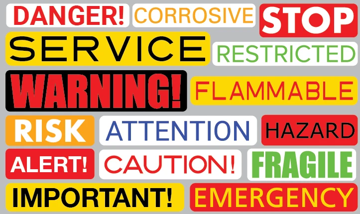
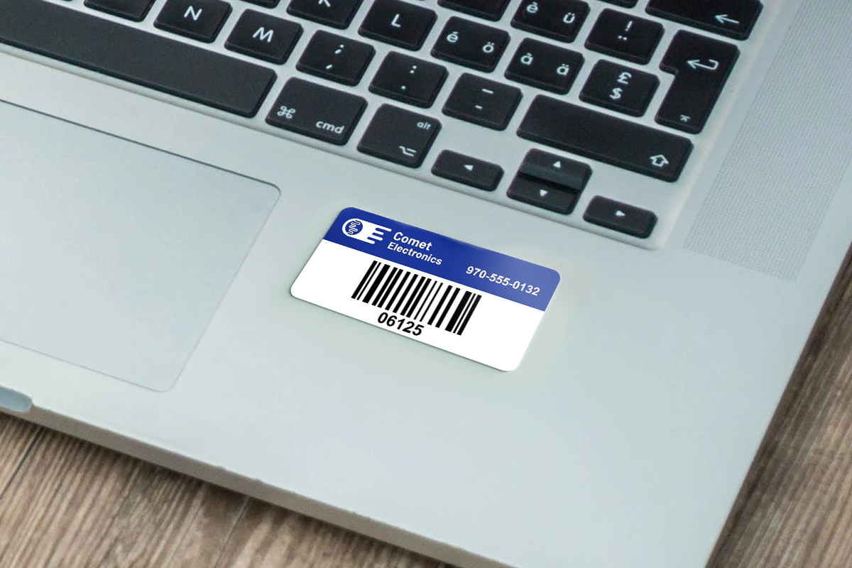
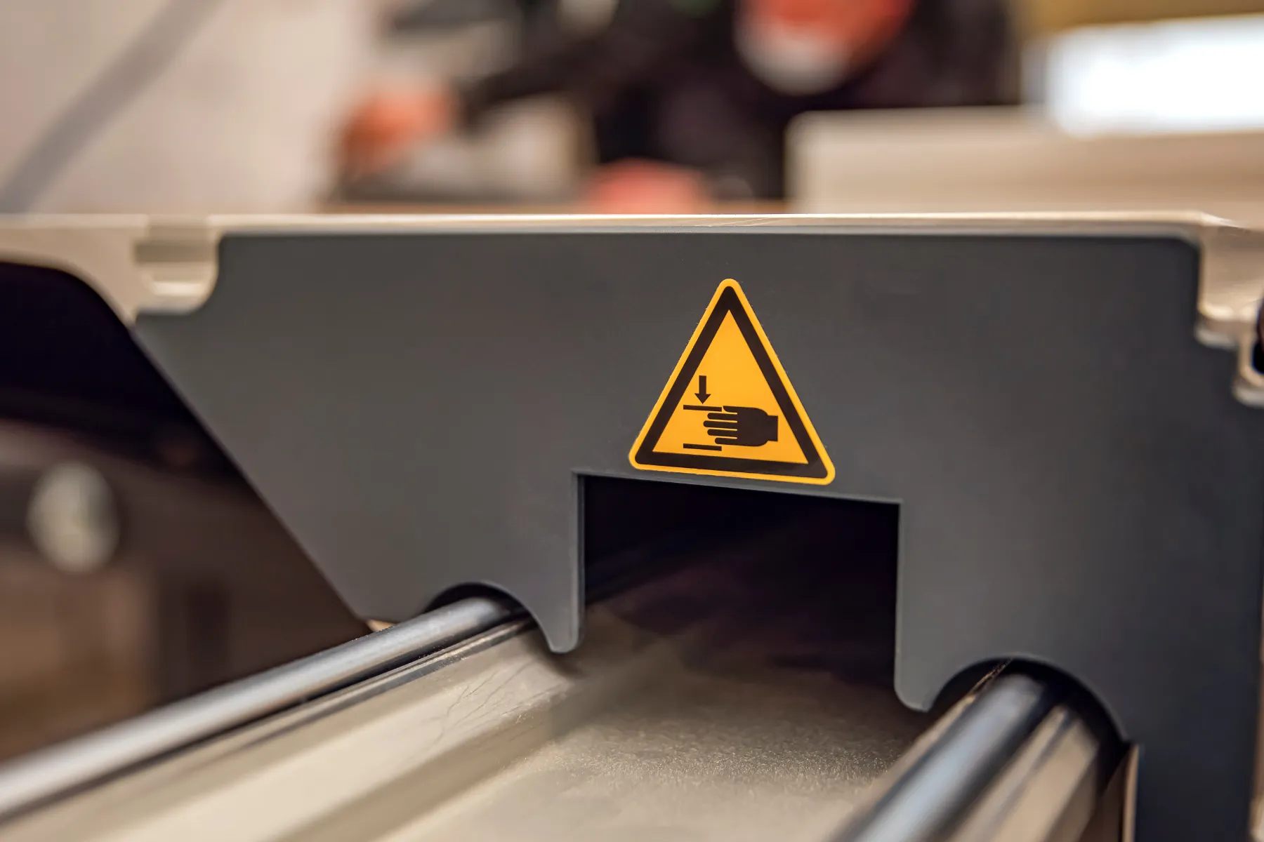
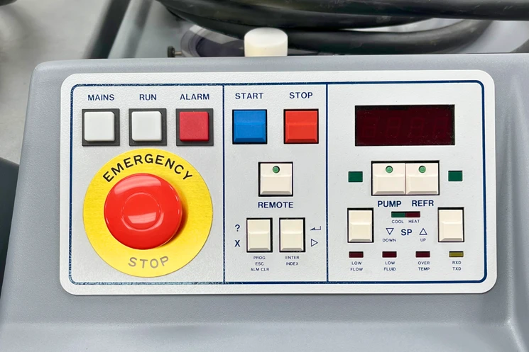
Choosing the right fonts for warning labels is critical for ensuring that your message is clear, legible, and impossible to ignore.
The best fonts for warning labels are bold, easy to read, and designed to grab attention even in challenging environments. Fonts like Helvetica, Arial, and Impact are popular because they balance readability and visibility.
We are going to share the top 10 fonts to use for warning labels, explain why each works, and offer tips to make your labels as effective as possible.
Whether you’re creating custom labels for industrial equipment or warning labels for consumer products, these font choices and design tips will help you create labels that stand out.
Helvetica
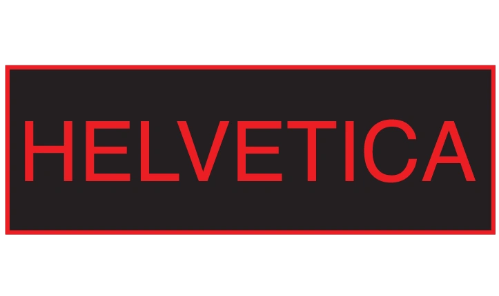
A classic choice for warning labels, Helvetica is known for its clean, neutral design. Its bold and heavy weights are ideal for creating clear, attention-grabbing labels.
Arial
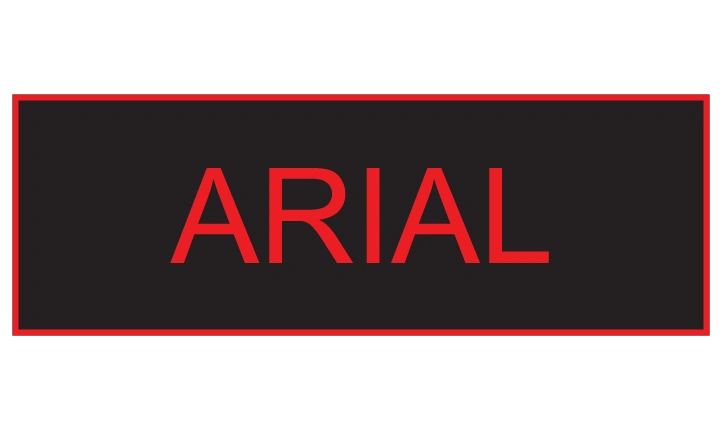
Similar to Helvetica, Arial is easy to read at a glance and works well in a variety of environments. Its versatility makes it a popular choice for custom labels and signage.
Univers

Univers is another highly legible font that works well for warning labels. It offers a range of weights and styles, making it adaptable for different types of labels.
Frutiger
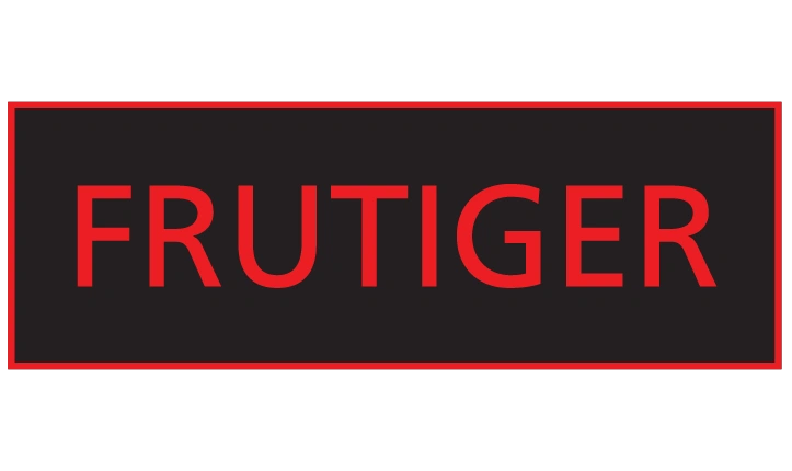
Frutiger’s rounded edges and simple design make it highly readable, even from a distance. It’s a great choice for warning signs that need to be seen quickly.
Roboto
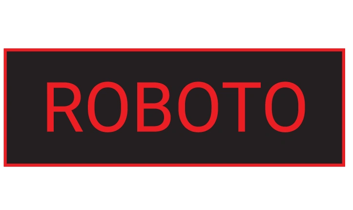
A modern font that balances readability and style, Roboto is commonly used for bold, clear labeling. Its heavy weights are particularly effective for warnings.
Impact
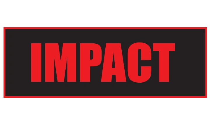
As the name suggests, Impact is designed to grab attention. Its thick, bold letters make it perfect for warnings that need to stand out in busy environments.
DIN 1451
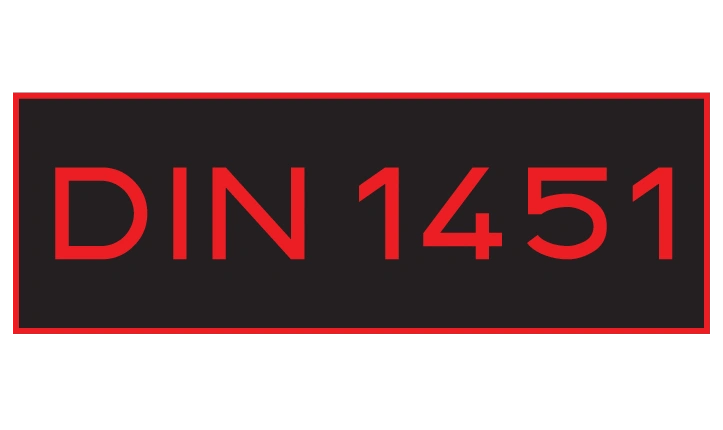
Originally designed for traffic signs, DIN 1451 is highly legible and perfect for industrial and safety-related labels. Its precise design ensures clarity.
Futura Bold
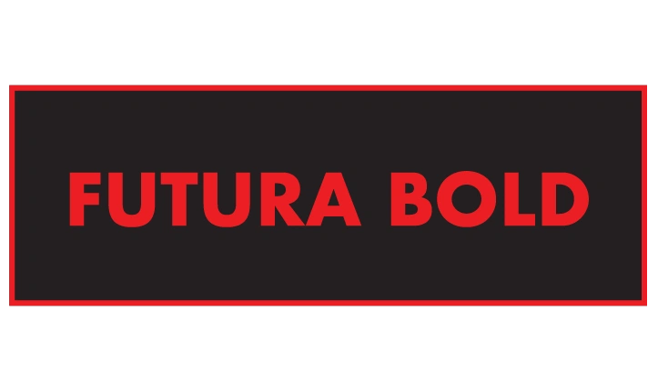
Futura Bold combines a clean geometric style with bold emphasis, making it easy to read on both small and large warning labels.
Verdana
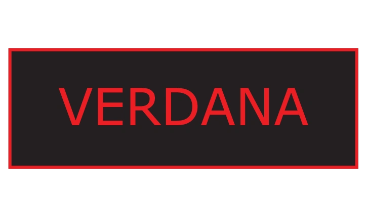
Known for its readability on screens and in print, Verdana is a solid choice for warnings that need to be clear in various conditions.
Proxima Nova
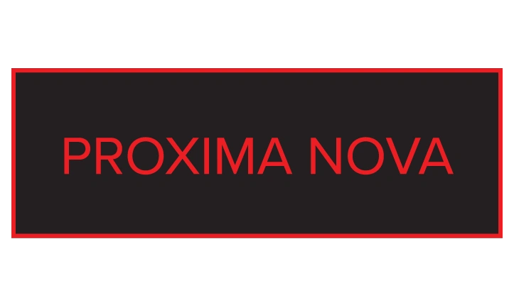
A modern sans-serif font, Proxima Nova offers high readability and works well for professional, sleek-looking custom labels.
Tips for Choosing Fonts for Warning Labels
Beyond selecting the right font, how you design the label is just as important. Follow these tips to create effective warning labels:
1. Use Bold or Heavy Weights
Bold fonts ensure that your message is easy to read from a distance or in low light. Always use heavy weights for the main warning text.
2. Avoid Italics and Decorative Fonts
Decorative fonts might look stylish, but they’re harder to read and can reduce the label’s impact. Stick to simple, professional fonts for clarity.
3. Maintain High Contrast
For example, use black text on a yellow or white background to make the text pop. This ensures your warning label stands out in any environment.
4. Consider All-Caps
Using all uppercase letters can make your warning label more noticeable and easier to read at a glance. This is especially important for safety-critical labels.
Why Choosing the Right Font Matters
The font you choose for your warning labels isn’t just about aesthetics—it’s about safety. In industrial settings, where workers need to act quickly, a clear and legible font can make all the difference. Similarly, for consumer products, clear labels can reduce liability and improve user experience.
Using professional fonts like Helvetica or Impact ensures your message is readable in any condition, helping you comply with safety standards while protecting your audience.
What This Means for Your Business
Choosing the right fonts for warning labels is about more than just design—it’s about communication and safety. Fonts like Helvetica, Impact, and DIN 1451 ensure your labels are easy to read, even in challenging conditions.
Combined with smart design tips like bold weights and high contrast, you can create effective custom labels that protect your team and comply with industry standards.Note: For high-volume label production with unique data requirements, consider the benefits of variable data printing. Learn more in our blog post on Variable Data Printing: What, How, and Why.
FAQs About Fonts for Warning Labels
The best fonts for warning labels are bold, simple, and easy to read. Examples include Helvetica, Arial, Impact, and DIN 1451, all of which offer excellent readability.
Yes, using bold or heavy fonts is highly recommended. Bold text ensures that the message is clear and catches attention, especially in safety-critical situations.
Font choice affects readability and visibility. A good font ensures that warnings are noticed quickly and understood, reducing the risk of accidents or errors.
No, decorative fonts should be avoided because they are harder to read. Stick to professional fonts like Arial or Verdana for clear communication.
Sans-serif fonts (like Helvetica) are better for warning labels because they are simpler and easier to read from a distance. Serif fonts, with their small decorative strokes, are not ideal for safety purposes.
The font used for “Preferential Discretion Warning” is typically a monospaced, machine-readable typeface such as OCR-A or OCR-B. These fonts were originally designed for optical character recognition (OCR) and are commonly used in official documents, asset tagging, banking, and government applications due to their standardized and easily recognizable letterforms.
Why OCR-A or OCR-B?
✔ High Legibility – Designed for machines and humans to read easily.
✔ Standardized Appearance – Frequently used in official and regulatory documents.
✔ Monospaced Design – Ensures uniform spacing, making it ideal for asset tracking and serial numbers.
If you need to identify the exact font used in a specific instance of “Preferential Discretion Warning,” you can use font detection tools like WhatTheFont or Adobe Fonts Matcherator to match the typeface.
Would you like help in selecting a font similar to OCR-A/B for your project? Let me know!
Helvetica
Why: Clean, sans-serif, widely used in signage for its high legibility.
Usage: Common in industrial and commercial environments.
Arial
Why: Similar to Helvetica but more universally available on digital platforms.
Usage: Acceptable substitute for Helvetica in digital or printed signs.
Clearview
Why: Developed for highway signage; optimized for readability at a distance and high speeds.
Usage: Ideal for larger safety signs, directional signs, and roadway warnings.
Frutiger
Why: Designed for signs and legibility in low-visibility conditions.
Usage: Good for airports, hospitals, and manufacturing settings.
Futura Bold / Futura Condensed
Why: Bold and geometric; used on older ANSI-style signs.
Usage: Still seen in legacy signage systems.
DIN 1451
Why: Standardized for German road signs and engineering documentation.
Usage: Frequently used in Europe for safety and technical signage.
📏 Font Style Guidelines (ANSI / OSHA / ISO)
Size:
Must be proportional to viewing distance.
ANSI Z535.2 recommends 1 inch of letter height per 25 feet of viewing distance.
Weight:
Use bold weights for key warnings or headings.
Avoid thin or stylized fonts.
Capitalization:
Use Title Case or All Caps for headers like “DANGER,” “CAUTION,” etc.
Use sentence case for instructional text for better readability.
Contrast:
Always ensure high contrast between text and background (e.g., black on yellow, white on red).
🛑 Regulatory Standards to Consider
ANSI Z535 (USA): Specifies formatting, color coding, and font guidelines for safety signs.
OSHA 1910.145: Enforces ANSI principles for workplace safety signage.
ISO 3864 (International): Provides standardized layout and design for safety signs globally.
