In the dynamic world of retail, where first impressions can make or break a sale, the power of label colors cannot be overstated. One of the most influential elements in catching the eye of potential customers is the color scheme used in product labels. The psychology of color plays a crucial role in consumer decision-making, impacting emotions and perceptions in ways we might not even consciously recognize.
To understand how colors attract customers to buy, it’s important to know some basic terminology. Hues are pure or saturated colors, and there are typically twelve of them. These include the primary hues of red, blue, and yellow, as well as secondary colors like purple, green, and orange.
Hues, Shades, Tints, Tones
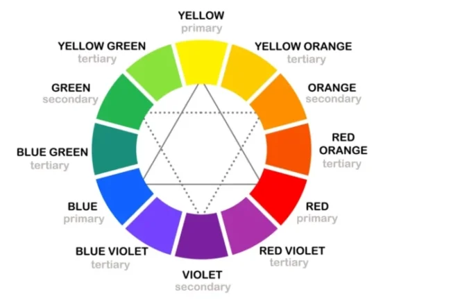
Tertiary colors are mixes of the primary and secondary colors. People consider blues and greens as cool colors, while they perceive reds and yellows as warm.
Color Schemes
The color wheel is a helpful tool for choosing which colors to use together. Monochrome schemes use variations of one hue, while complementary schemes use colors from opposite sides of the wheel. Also, triad and tetrad schemes involve three or four colors. Online resources like Adobe Color or Paletton can assist in selecting the right color schemes.
By leveraging color schemes you can get interesting color combinations. Determining the right color scheme for your label will depend on your branding and industry.
Contrast Matters
Contrast plays a crucial role in making product labels stand out and legible. High contrast, which refers to a difference in tone rather than color, is best for readability. Black and white has the highest contrast of 21:1.
Considering contrast for color-blind individuals is important as well. Online tools like the Coblis colorblind simulator can help test how colors appear to those with color blindness.
Know Your Audience
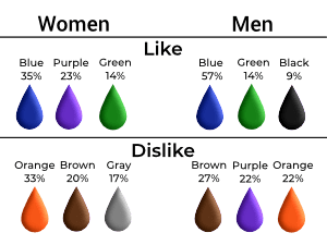
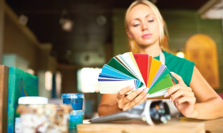
When designing product labels, it’s essential to consider the preferences of your target audience. Surveys have shown that women generally prefer blues, greens, and purples, while men lean towards blues, greens, and black.
Some people may not like certain colors. Therefore, it is advisable to use them as accents rather than making them the main focus.
Different age groups have different color preferences. Children tend to like primary colors.
By using these tips and thinking about how color attracts customers, you can create labels that catch buyers’ attention.
Exploring Color Associations Around the World
The Global Color Survey, with over 300,000 respondents, provides valuable insights into color associations. People consistently prefer blue as a favorite color, while they often view dark yellow as the least favorite. This database helps you find colors that appeal to your target audience by looking at their demographics.
Colors and Their Traits in Common Industries
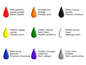
Studies have shown that certain colors evoke specific emotions and characteristics. Credit card logos use blue because it creates a sense of security and trustworthiness in people. Red symbolizes speed and passion, black signifies luxury, and brown – is affordability. Purple symbolizes dignity and courage, closely followed by red.
Warm colors like orange and yellow link fun and positivity. Warning and alarm signs also reflect these color associations.
Incorporating Color into Your Labels
Feeling inspired to revamp your labels? Experimenting with pops of color, different shades, or switching between color schemes can be a great way to make your labels stand out.
Consider doing a small run of labels to test the response from your customers. Their feedback could provide valuable insights for future designs. Finding the best colors for your labels can affect how your labels stand out on shelves.
Remember, in addition to choosing label colors, you also have the option to explore various label materials. Foils, metallics, and colored, and patterned materials can enhance your label design.